Exercises 7.4 Exercises
1.
Scores on a Math test are listed below.
80, 90, 50, 100, 50, 80, 90, 70, 70, 30, 70, 80, 100, 80, 60, 70, 70, 100, 80, 60, 70, 60, 50, 50
Complete the frequency table for the Math test scores
Construct a bar graph of the data
Construct a pie chart of the data
2.
A group of adults where asked how many cars they had in their household. Their results are listed below.
1, 1, 4, 2, 2, 1, 2, 3, 1, 2, 2, 2, 3, 1, 3, 2, 1, 1, 4, 1, 2, 1, 2, 2
Complete the frequency table for the car number data
Construct a bar graph of the data
Construct a pie chart of the data
3.
A group of adults were asked how many children they have in their families. The bar graph shows the number of adults who indicated each number of children.

How many adults were questioned?
What percentage of the adults questioned had 0 children?
15
33%
4.
Jasmine was interested in how many days it would take an order from an online store to arrive at her door. The graph below shows the data she collected.

How many orders did she place?
What percentage of orders arrived in one day?
5.
The bar graph below shows the percentage of students who received each letter grade on their last English paper. The class contains 20 students. What number of students earned an A on their paper?

6.
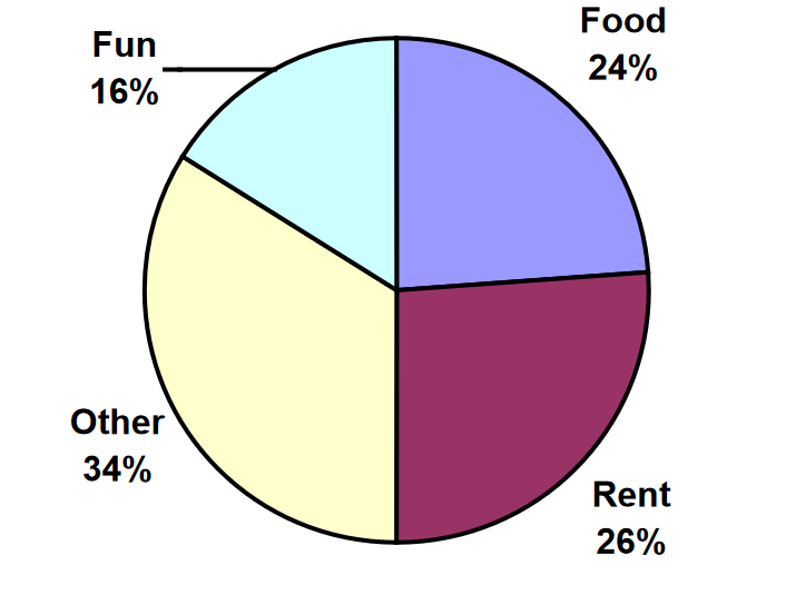
Kori categorized her spending for this month into four categories: Rent, Food, Fun, and Other. The percents she spent in each category are pictured here. If she spent a total of $2600 this month, how much did she spend on rent?
7.
The data below gives the price (in dollars) of a gallon of gasoline at several gas stations in the area.
2.54, 2.78, 3.23, 3.56, 2.98, 2.77, 3.15, 3.24, 3.35, 2.87, 2.49, 2.63, 3.15
Group the data into class intervals of width 50 cents, starting at $2.00.
Create a histogram of the data.
8.
A rec center counted the number of people using the center once every hour on Sundays to decide if it should reduce its hours. The results they obtained are summarized in the graph below.

What was the smallest number of visitors in the rec center and how many times did it occur?
For how many hours were visitors counted?
For what percent of the hours counted were there fewer than 5 visitors in the rec center?
If you were deciding whether to reduce hours on Sundays would you want any additional information?
9.
For the dataset: {2, 5, 8, 10, 15, 25, 25}
Find the mean
Find the median
Find the mode
Find the first quartile
Find the third quartile
12.86
10
25
5
25
10.
The table shows Joe’s golf scores from last week:
| Golf Score | Frequency |
|---|---|
| 2 | 6 |
| 3 | 8 |
| 4 | 11 |
| 5 | 4 |
| 6 | 3 |
| 7 | 1 |
| 8 | 2 |
| 10 | 1 |
What was the total number of holes of golf that Joe played last week?
What was Joe’s average golf score?
What was Joe’s median golf score?
11.
The graph represents the number of stars earned by 150 performers in a talent competition. What was the mean number of stars earned?

12.
The scores on a 50-point multiple choice exam are given in the following frequency table.
| Exam Score | Frequency |
|---|---|
| 38 | 6 |
| 40 | 2 |
| 41 | 5 |
| 43 | 2 |
| 45 | 1 |
| 46 | 1 |
| 49 | 2 |
| 50 | 4 |
What was the mean score on the exam?
The median score?
The first quartile?
The third quartile?
13.
A group of diners were asked how much they would pay for a meal. Their responses were:
$7.50, $8.25, $9.00, $8.00, $7.25, $7.50, $8.00, $7.00
Find the mean
Find the median
Write the 5-number summary for this data
Find the standard deviation of this data
$7.78
$7.75
$7.00, $7.375, $7.75, $8.125, $9.00
0.637
14.
You recorded the time in seconds it took for 8 participants to solve a puzzle. The times were:
15.2, 18.8, 19.3, 19.7, 20.2, 21.8, 22.1, 29.4.
Find the mean
Find the median
Write the 5-number summary for this data
Find the standard deviation of this data
15.
Refer back to the bar graph about the group of adults who were asked about the number of children they have.
Figure 7.4.1Compute the mean number of children for the group surveyed
Compute the median number of children for the group surveyed
Write the 5-number summary for this data.
Create box plot.
1.4667
Median is 8th data value: 1 child
0,0 1,2,5
16.
Refer back to bar graph analyzing the number shipping days for an online order to arrive.
Figure 7.4.2Compute the mean number of shipping days
Compute the median number of shipping days
Write the 5-number summary for this data.
Create box plot.
17.
The box plot below shows salaries for Actuaries and CPAs.

Kendra makes the median salary for an Actuary.Kelsey makes the first quartile salary for a CPA. Who makes more money? How much more?
What percentage of actuaries makes more than the median salary of a CPA?
18.
The dataset below summarizes the starting salaries of 20 recent graduates. Find the standard deviation of this dataset.
| Salary | Frequency |
|---|---|
| 20,000 | 1 |
| 30,000 | 4 |
| 40,000 | 5 |
| 50,000 | 9 |
| 150,000 | 1 |
19.
The test scores in a history class had a mean of 76% with a standard deviation of 4%. If an A is given to anyone with a test score 2 standard deviations above the mean, what is the cutoff score to earn an A?20.
A manager of a human resources department is investigating the number of sick days employees took during the last year. For employees in marketing, the average number of sick days was 4.5 with a standard deviation of 2. For those in accounting the mean number of sick days was 5.8 with a standard deviation of 3. Compute and compare the coefficients of variation for each set of data.
21.
Ellen’s average commute time is 30 minutes with a standard deviation of 8 minutes. Zac’s commute takes an average of 45 minutes with a standard deviation of 10 minutes. Whose commute has more consistent times?22.
Studies are often done by pharmaceutical companies to determine the effectiveness of a treatment program. Suppose that a new AIDS antibody drug is currently under study. It is given to patients once the AIDS symptoms have revealed themselves. Of interest is the average length of time in months patients live once starting the treatment. Two researchers each follow a different set of 40 AIDS patients from the start of treatment until their deaths. The following data (in months) are collected.
Researcher 1: 3; 4; 11; 15; 16; 17; 22; 44; 37; 16; 14; 24; 25; 15; 26; 27; 33; 29; 35; 44; 13; 21; 22; 10; 12; 8; 40; 32; 26; 27; 31; 34; 29; 17; 8; 24; 18; 47; 33; 34
Researcher 2: 3; 14; 11; 5; 16; 17; 28; 41; 31; 18; 14; 14; 26; 25; 21; 22; 31; 2; 35; 44; 23; 21; 21; 16; 12; 18; 41; 22; 16; 25; 33; 34; 29; 13; 18; 24; 23; 42; 33; 29
Create comparative histograms of the data
Create comparative boxplots of the data
23.
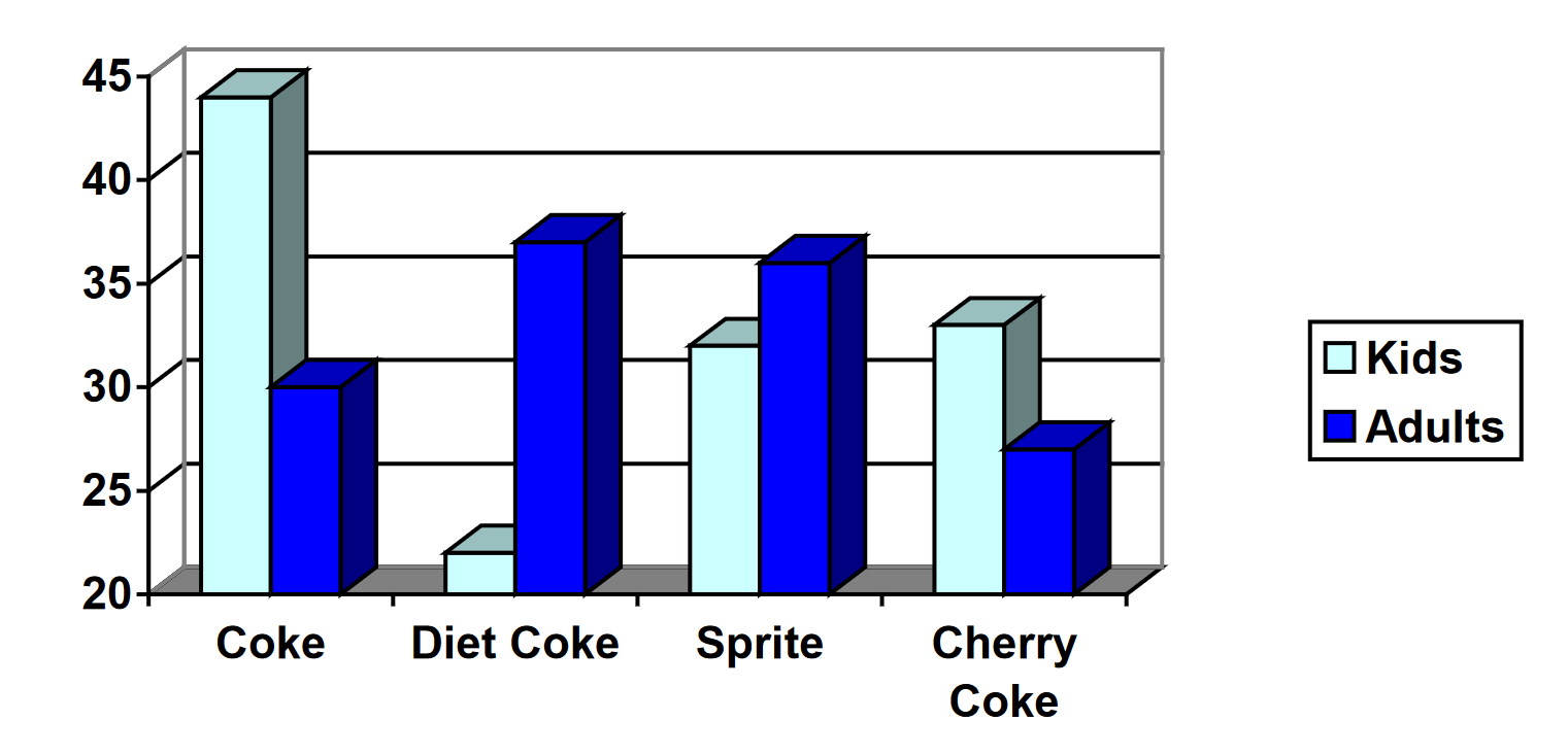
A graph appears below showing the number of adults and children who prefer each type of soda. There were 130 adults and kids surveyed. Discuss some ways in which the graph below could be improved.
24.
Make up three data sets with 5 numbers each that have:
the same mean but different standard deviations.
the same mean but different medians.
the same median but different means.